Swim lane displays can be created in the Tasks App under Work Plan in the Oracle Primavera Cloud (OPC). Using Swim Lane displays allows the user another option to review and make changes to tasks. Swim Lanes can be grouped by company then user, user then company, or just company or user. Along with providing views of tasks (and activities) by whichever grouping you choose, you can reassign tasks to a different company, user or both using the task details or by dragging and dropping the task to the required group in the work plan.
Written by Mary Lynn Backstrom, PMP, PMI-SP, PMI-BA – Implementation Specialist
on Thursday, 02 November 2023.
Posted in All Articles, Oracle Primavera Cloud (Prime)
Do you monitor the ‘What’s New’ information for new versions of Primavera P6? Here are a few things to keep in mind when working in the P6 Client. For those using P6 v20.4 (or higher), there are a couple of new pieces of functionality (introduced in v20.4 of P6 Professional) that can prove helpful. This functionality allows the addition of comments about relationships as well as the functionality allowing role prices to vary over time.
Regarding the functionality to add comments about relationships, I am not suggesting that every relationship line in your P6 schedule requires comments added; however, in some circumstances it can be a handy functionality. The comments column can be added in the relationship details tab (predecessors/successors or relationships) and then the comments required can be added. Perhaps you have a lag on the relationship, or, like below, you want to confirm a relationship. Relationship comments are plain text and can be up to 250 characters long.
Written by Mary Lynn Backstrom, PMP, PMI-SP, PMI-BA – Implementation Specialist
on Wednesday, 25 October 2023.
Posted in All Articles, Primavera P6
Safran Risk has released v22.2.0. Read about all the exciting new features.
Written by Ian Nicholson

Safran Risk has released v22.2.0. Read about all the exciting new features.
New Features
-
It’s now possible to login to Safran Risk using Azure Active Directory
-
Advanced impact option that lets risks impact activities and costs in new ways. For example, it’s now possible to spread an absolute risk impact over multiple elements. You can also limit the number of mapped elements that will be impacted each iteration.
-
Column picker that lets you select which columns to show.The ability to add a number of new columns that lets you see the distribution values and more as columns.
-
If you’re using Risk Mapping for inputting activity duration uncertainty, it’s now possible to use all distributions here. You can also use absolute and relative.
Enhancements
-
Activity Duration Uncertainty can now be set to any distribution in the Risk Mapping tab
-
Advanced Impacts lets you spread impact over activities or costs and limit the number of impacted elements
-
Schedule data can now be seen as columns in the Risk Mapping tab
-
On a multi-user database the project is now opened in Update Mode (instead of Exclusive) after an import
-
New columns in the Project Risks tab: Schedule Distribution (Pre andPost), Cost distribution (Pre and Post), Post-Mit Probability, Impact Independently, Notes, and Mappings Count
-
Activity Duration has been added to the Risk Mapping Excel import/export. This will allow setting duration uncertainty in Excel.
-
Resource tab added to Risk Mapping so that resources for each activity can be seen
on Wednesday, 18 October 2023.
Posted in News, Safran
Project issues can be very disruptive and expensive. In executing projects, issues can (and most often do) arise at various points. Having a good set of project control procedures and monitoring what processes are in place enables your team to identify issues and act quickly. Meanwhile, creating mitigation plans based on current, correct information is a must. Making decisions based on old data will not set your project and team up for success, and having your team endure long wait times to retrieve, assemble, and analyze current project information when you’re waiting for decisions to be made is not an effective approach either.
If your team’s struggling with time-consuming manual updates, there are tools that can help you automate the process. Emerald’s
P6-Loader allows you to use Excel-based update sheets to load updates into your progress file. Another one of our tools,
TAPS, facilitates updating P6 using activity barcodes (TAPS Classic) or process updates using TAPS Mobile from your phone. These tools make it quick and painless to get accurate updates into your P6 files. Your team will then have more time for analyzing your schedule instead of wasting time with tedious updating.
Written by Mary Lynn Backstrom, PMP, PMI-SP, PMI-BA – Implementation Specialist
on Tuesday, 17 October 2023.
Posted in All Articles, P6-Reporter
Let’s take a high-level look at the timesheet functionality in Oracle Primavera Cloud (OPC). Timesheets provide functionality allowing users to enter hours worked against projects. The project hours are logged against resource assignments on activities. Security privileges assigned to users for timesheets are based on the actions they require access to perform on a timesheet.
OPC contains Timesheet User, Timesheet Supervisor and Timesheet Approvers. Timesheet Users can create timesheets, log time against activities on projects, and submit them for approval. Timesheet Supervisors can create their own timesheets and enter time. They can also create timesheets for the resources assigned to the projects for which they are the timesheet supervisors. They can enter time on behalf of the resources and submit their timesheets for approval. Timesheet Approvers can create their own timesheets and enter time. They can also create timesheets for the resources for which they have been assigned as the timesheet approver. They can enter time, submit, approve, or reject their resources' timesheets.
Written by Mary Lynn Backstrom, PMP, PMI-SP, PMI-BA – Implementation Specialist
on Sunday, 17 September 2023.
Posted in All Articles, Oracle Primavera Cloud (Prime)
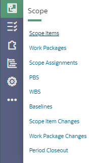
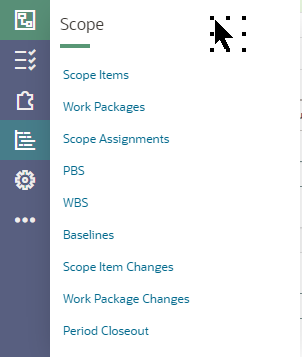
Are you new to using Oracle Primavera Cloud (OPC) for your project scheduling? When entering or importing information, keep in mind OPC is structured into modules. When you login, you will have icons available for the modules you have been assigned access to. For a quick walk through of a few items of interest, we will start by looking at the Utilizing the Scope Module which gives access to the windows in the list below.
Written by Mary Lynn Backstrom, PMP, PMI-SP, PMI-BA – Implementation Specialist
on Monday, 11 September 2023.
Posted in All Articles, Oracle Primavera Cloud (Prime)
Have you ever had a critical piece of data deleted in your Primavera P6 database and needed to recover it?
A client of ours had just this sort of scenario.
The user reached out to us in a panic. This user had just been given increased access in P6 and had renamed an existing UDF. He realized it was renamed improperly and instead of changing the name of the UDF, he deleted it. The project level User Defined Field (UDF) had data assigned to many of their projects. They needed to recover it and ensure the values were reinstated on their projects. We were able to recover the data in less than and hour and a half.
Written by Sue Fermelia - Implementation Specialist
on Friday, 25 August 2023.
Posted in All Articles, P6-Auditor, P6-Loader
Your project is in execution. What schedule update options do you have out of the box using Oracle Primavera Cloud (OPC)? There is more than one approach available to updating your schedule of course. Updating in OPC can start with task updates and progress to updating the activities in the schedule.
The work plan receives updated status on the tasks. The updates for tasks can be entered in the task list window as well.
Written by Mary Lynn Backstrom, PMP, PMI-SP, PMI-BA – Implementation Specialist
on Saturday, 05 August 2023.
Posted in All Articles, Oracle Primavera Cloud (Prime)
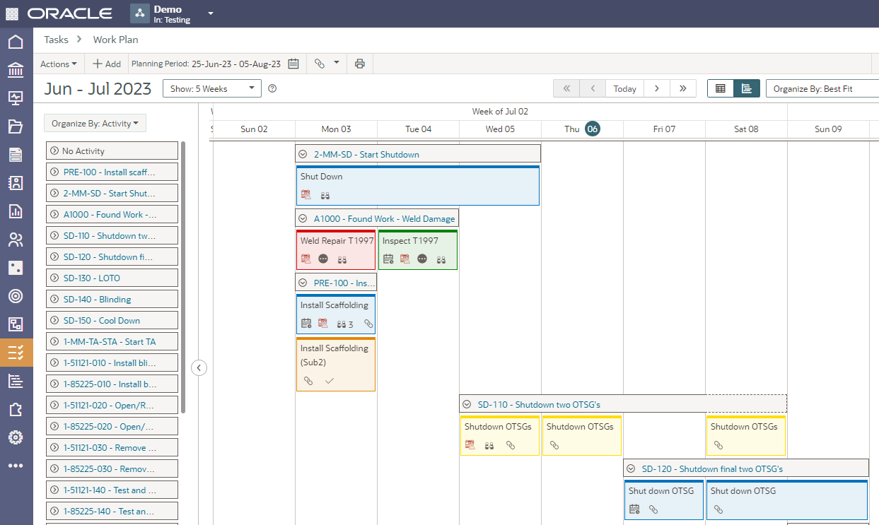
The Work Plan screen in Oracle Primavera Cloud is a virtual planning board available for use by the companies working on a project to coordinate their tasks. This functionality allows adding tasks, assigning, and monitoring task constraints, commitments to dates, and placing tasks in sequence using hand-offs. Tasks can be color-coded according to their assigned company. Task cards are customizable to display information important to your project. You can customize the board display from a daily view to up to six weeks.
The Work Plan screen planning board provides easy sequencing for your tasks. Create tasks and then drag and drop them onto the planning board to build your work plan. Change the hand-off mode that is selected. Enable activity bands to assist with assigning tasks to activities. Easily move the planning board time period to previous or future periods. Application of quick filters to the tasks is available as well as grouping them by best fit or by company to organize the view.
Written by Mary Lynn Backstrom, PMP, PMI-SP, PMI-BA – Implementation Specialist
on Monday, 31 July 2023.
Posted in All Articles, Oracle Primavera Cloud (Prime)
If you have an .xer or Primavera .xml format file and you’re looking to set up a schedule in Oracle Primavera Cloud, you can start importing those files from the Projects window under the Actions menu.
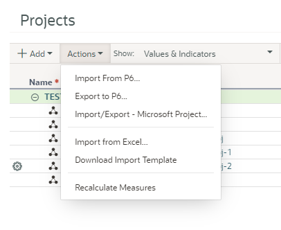
By clicking on Activities from the Schedule icon in Oracle Primavera Cloud, you can reach the upload template from the Actions menu in that window. You can also choose to enter your project schedule information manually.
Written by Mary Lynn Backstrom, PMP, PMI-SP, PMI-BA – Implementation Specialist
on Sunday, 23 July 2023.
Posted in All Articles, Oracle Primavera Cloud (Prime)
In Oracle Primavera Cloud (formerly Oracle Prime), you can create and track scope items, work packages, and WBS elements.
If you’re not using the default PBS structure, you can set up a custom PBS structure. The PBS structure commonly reflects a hierarchical structure of the components required for a project. You can use a PBS in initial planning to organize scope items.
Written by Mary Lynn Backstrom, PMP, PMI-SP, PMI-BA – Implementation Specialist
on Monday, 17 July 2023.
Posted in All Articles, Oracle Primavera Cloud (Prime), Other
Recently, I was working with a client who was reorganizing. This client has many business units (BU) that work in the same database, so they have a prefixing standard for each BU.
When they reorganized, all the prefixing for several BUs needed to be brought into alignment with the reorganized BU structure. This involved moving their EPS structure around and updating the prefixes on calendars, codes, resources and roles. I had started moving the structures to accommodate the changes and updating the prefixes with P6-Loader, but I also did some updating directly in P6. I had completed roles and was partially through resources when the client realized their reporting may be effected by the changes. They wanted to revert all the changes I had made. While I did have several P6-Loader change files that I could use to revert the changes I made using P6-Loader, I wanted to be sure the manual changes I made were also restored.
Written by Sue Fermelia - Implementation Specialist
on Thursday, 29 June 2023.
Posted in All Articles, P6-Loader
Our latest version of P6-Auditor has a new look and feel making auditing definitions easier and faster to build.

Our latest version of P6-Auditor has a new look and feel making auditing definitions easier and faster to build.
New Features
-
New audits - UDF value, project, activity and code assignments
-
Users can be configured into categories. For example, P6-Internal, Standard, API, or by department, or by whichever criteria is needed. The User Category column is shown in all reports where there is a user column, and it is possible to filter by it.
-
It is possible to configure UDFs and code changes to be reported with the corresponding project, activity or resource record
-
Added the ability to easily limit the range of events retrieved from the server - for example, for the past 5 minutes, 15 minutes, etc.
-
UI changes - the reports are now all shown on the left side of the auditor web application and are grouped by type/subject leaving more space for the reports on the right side of the page
-
The EPS auditing now includes changes made to all records in the PROJWBS table, and it includes a column that shows the type of object that was changed
-
Added the ability to freeze columns. You can freeze 1 to 5 columns and those will always be visible when scrolling.
Enhancements
-
All reports now run faster, and event reports run much faster than before
-
Filters have been improved - when possible, multiple options are shown for the user to select from
-
Reworked the OData implementation on the server, allowing much better control over the columns shown in the client, as well as other improvements
-
Layouts now work properly with audit reports
-
Column order that makes sense across all event reports
-
Profile improvement - the teams of a profile are shown in the profile list and a button that lets you save a profile directly is visible when a profile has changes
on Sunday, 28 May 2023.
Posted in News, P6-Auditor
A solution for common cases of accidental data deletion in Primavera P6

Accidental deletion of important data is something that happens. Everyone has done it at some point.
In Primavera P6 EPPM, some of the most common cases of accidental data deletion are:
- Deletion of the wrong resource
- Deletion of the wrong project
- Deletion of the wrong WBS node or nodes
Written by Ravi Wallau - Integration Specialist, Sue Fermelia - Implementation Specialist
on Tuesday, 16 May 2023.
Posted in All Articles, P6-Auditor, P6-Loader, Primavera P6
Safran Risk has released v22.1.0. Read about all the exciting new features.
Written by Ian Nicholson

Safran Risk has released v22.1.0. Read about all the exciting new features.
New Features
-
Automatic Report Package Generator - Functionality to generate a report package that contains a number of output chart images, a Word report, and an Excel report. The report package can be run and customized from the analyze tab.
-
The UI of the sensitivity analysis tab has been updated. It now also allows you to run sensitivity against a schedule summary and against the schedule types duration and start date.
-
Cost Module - It's now possible to have more than one top node and to set the type for each top node.
-
The import of external files now allows three options when updating an existing project: overwrite, update, and append.
-
Distribution Graph - It's now possible to set the target to the value of a user field. This allows you to set up target dates for all the activities in the schedule.
Enhancements
-
Hammock to Hammock links are now allowed by the Safran Risk scheduler.
-
Mode added to distribution graph information.
-
Recent projects are now opened with the same access level as they were opened last time.
-
Added option to grouping in the cost tab to see the whole path in the summary ID field.
-
Added Total Float, Free Float, and Calendar to the Activity Information tab in Risk Mappings.
-
Risk Mean Start and Risk Mean Finish columns added to the schedule.
-
Added option for image size for all the output charts. This allows for consistent size of the generated images regardless of the state of the Safran Risk window.
on Wednesday, 03 May 2023.
Posted in News, Safran
